Applications
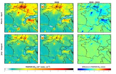
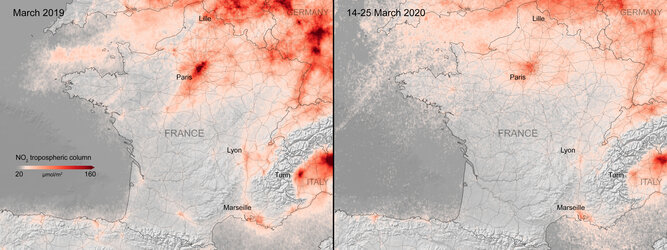
Nitrogen dioxide concentrations over densely populated and industrialised areas of Europe
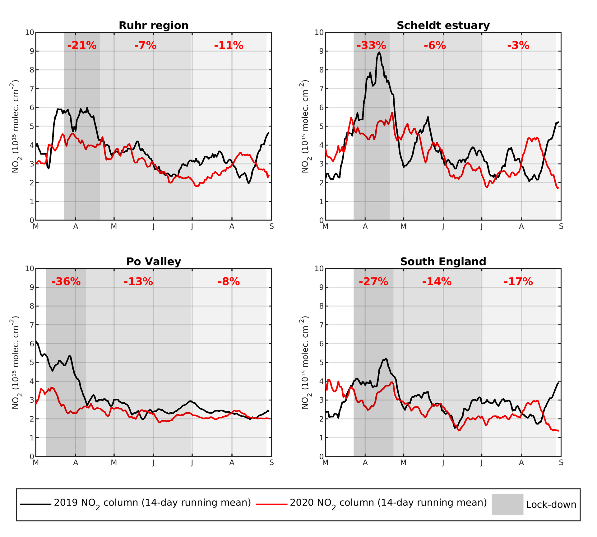
This graph shows the averaged nitrogen dioxide concentrations over the Ruhr region, Scheldt estuary, Po Valley and South England. The graphs shows concentrations (using a 14-day moving average) in 2019 compared to 2020 using data from the Copernicus Sentinel-5P satellite.
The shades of grey denote the lockdown periods in 2020, moving progressively from strict (dark grey) to loose (light grey) measures. The percentages shown in red represent the column reduction in 2020 compared to 2019 over the same period.
Read full story: Air pollution in a post-COVID-19 world