Right on target
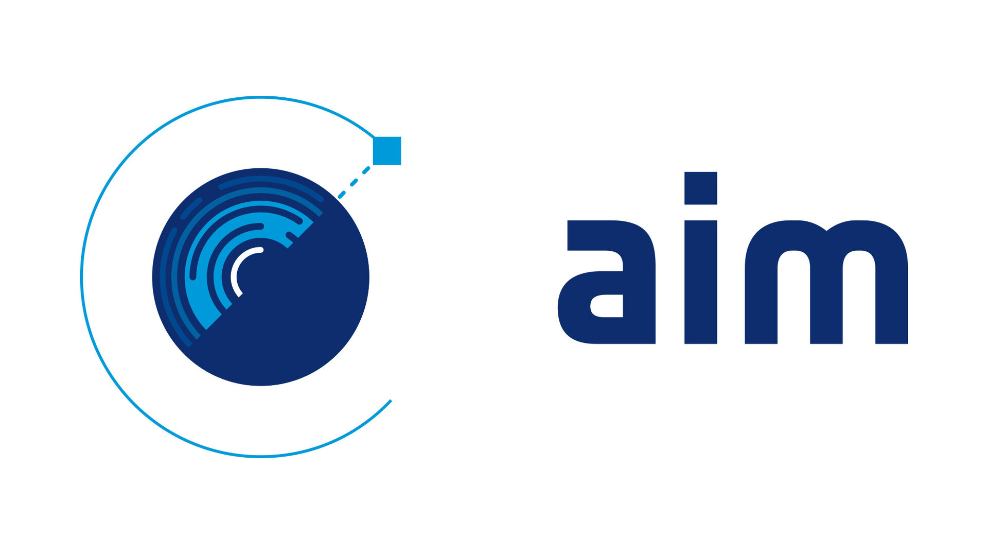
With a new candidate mission, such as the Asteroid Impact Mission (AIM), comes a new logo. Extensive thought went into designing a logo that fits the mission objectives. The AIM team is therefore proud to present their new logo, designed by ESA’s Corporate Design and Graphics Unit (Communication Department) based at ESRIN.
Fabrizio L'Abbate, the Head of this Unit, explains the rationale: "During the designing and studying phase of the design logo, we made a deep analysis of the various aspects of the AIM mission in order to understand its development processes and objectives. Through modern, simple and linear shapes, we tried to create a symbol that could, on the one hand, represent the concept of discovery and exploration, and, at the same time, convey the idea of reliability related to the in-depth studies carried out for the mission design."

"The estimated duration of the mission made us develop a possibly 'timeless' design, that is innovative as well as long-lasting, accompanying the identity of the mission for the years to come", adds Flavia Zonno, one of the designers on the team.

Marta Mulinacci, multimedia designer in the Unit, mentions: "In creating this logo we have also taken into account possible future applications, which will eventually allow the development of an animated version for multimedia channels."

AIM is founded on the three pillars of Asteroid Impact Mitigation, Technology and Science, and the logo represents these three aspects really well. The design team went through great lengths to produce a logo that emphasises not only that AIM's objectives are three-fold but also that it is part of the dual AIDA (Asteroid Impact and Deflection Assessment) mission together with the NASA-led DART (Double Asteroid Redirection Test).


