Life story of the ESA logo
It’s been said that every picture tells a story. The same is true of the deceptively simple ESA logo. Its story began with the formation of ESA, and its evolving design has reflected a changing world and the growth of the agency.
The ESA logo’s story begins in 1975, a key moment in space history that saw the European Space Research Organisation (ESRO) and European Launcher Development Organisation (ELDO) merge to form the European Space Agency, ESA. Its first Director General, Roy Gibson, wanted to establish a strong identity for the new space agency and to emphasise how it united Europe’s space sector. With this in mind, he promoted the agency’s name as ‘ESA’ and a visual device, the roundel, was created to complement it. Together, they would become the first ESA logo.
The team that created the logo wanted it to represent the goals and values of the newly-formed ESA, so every detail was considered. The roundel stood for our home planet, Earth, and the ‘e’ on the surface of this globe stood for European, as the letter ‘e’ was common to all the languages of ESA’s Member States.
The ‘e’ also stood for Europe, at the centre of space activities. A small white dot represented a satellite, while a series of curved lines suggested the orbits of spacecraft or parallels (lines of latitude used on maps for navigation).
One thing wasn’t anticipated: many people saw the roundel’s curved lines as a human fingerprint. This added an appealing human angle, especially as ESA became more involved in human spaceflight. So the idea stuck, becoming part of the roundel’s backstory, and it was often nicknamed the ‘thumbprint’.
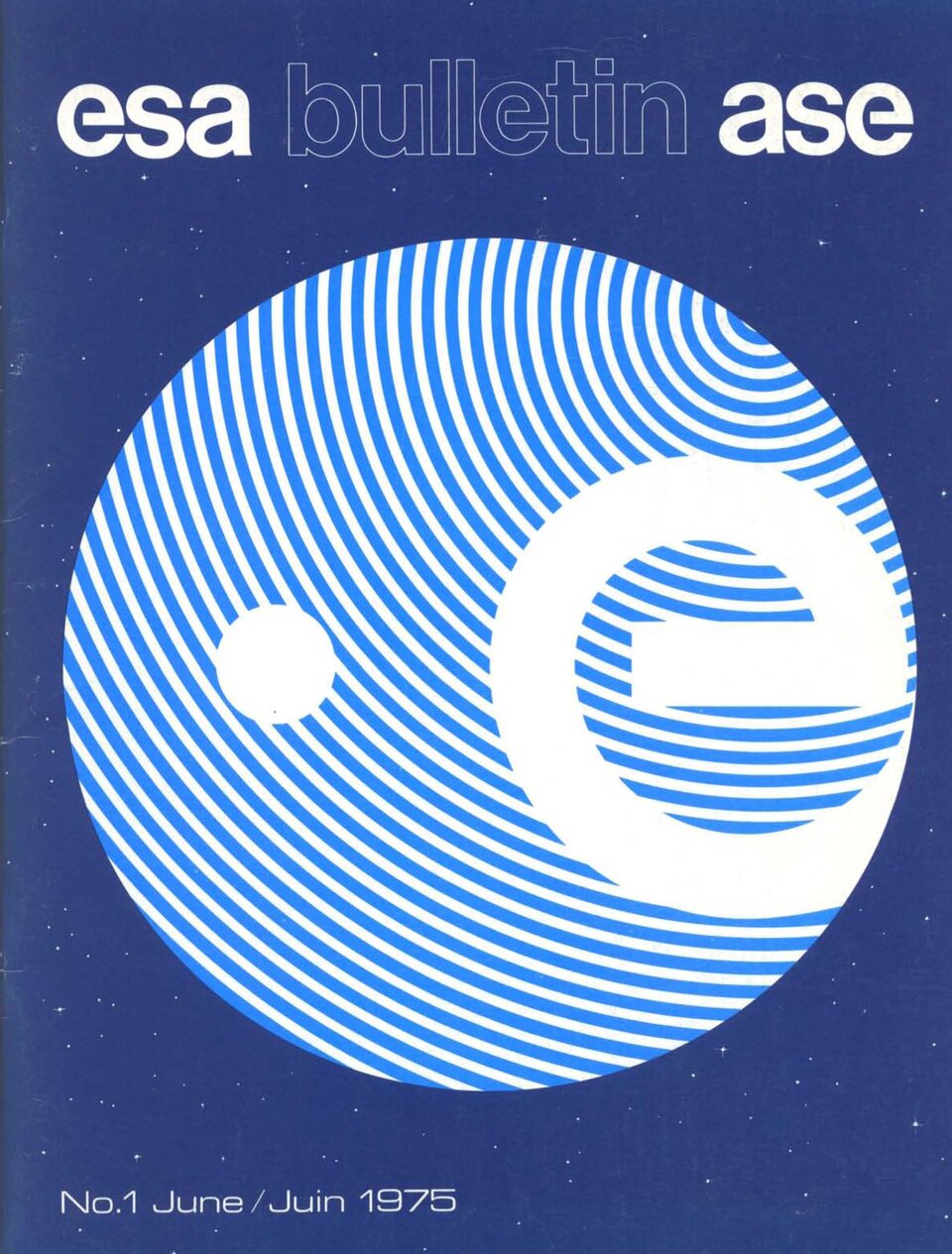
Packed with symbolic meaning, the logo was also highly practical for an international organisation. Being a visual device, the ESA roundel worked across the boundaries of different languages. Initially used on official documents, business cards and stationery, the ESA logo went on to become the cover star of the first issue of ESA Bulletin, the agency’s in-house magazine.
Then, in 1977, the roundel symbol and ESA name were combined and the first set of corporate identity guidelines were issued. It was the start of a branding journey that would see some changes – though the logo’s original concept would remain central to ESA’s visual identity.
During the following decades, the ESA logo faced a new world, increasingly filled with TV channels, then the Internet, smartphones and social media. The logo’s fingerprint motif suffered on screens, because the stripes flickered (an optical effect known as ‘Moiré interference’). To solve this, the lines were reduced, then removed altogether as ESA launched its web portal.
Fast-forward to the present day. We live in an age of information overload, with multiple channels clamouring for attention, so discoverability is key. The ESA brand needed stronger, more consistent application to ensure instant recognition.
That is why we now have just one logo, suitable for all uses, and one set of guidelines to make it easier to reach our varied audience.
The modern ESA logo cuts through the noise, redesigned as part of a corporate visual identity that tells our story and expresses ESA’s aspirations and values wherever you see it.
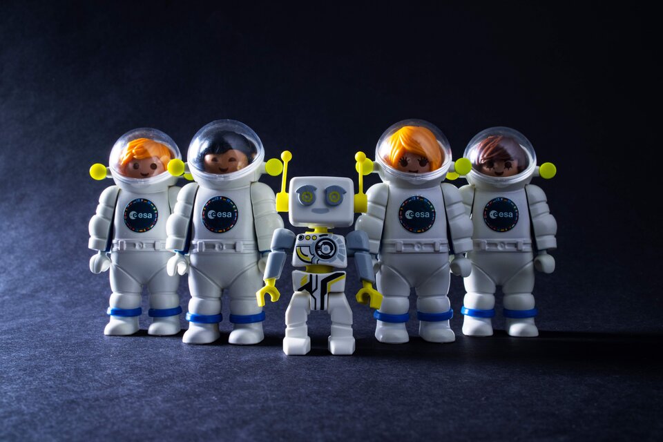
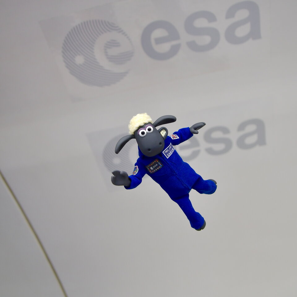
Today, you can spot the ESA logo in all kinds of places, from social media, to iconic spacecraft and inspirational children’s toys. From simple beginnings as branded stationery, the ESA logo has become the centrepiece of a globally respected brand.
- Visit our Brand Centre to find out more about what we do.
- Discover the amazing partners who work with the ESA brand.
- Want to use the ESA logo or branding? Find out more here.