Agency
Surface current speed
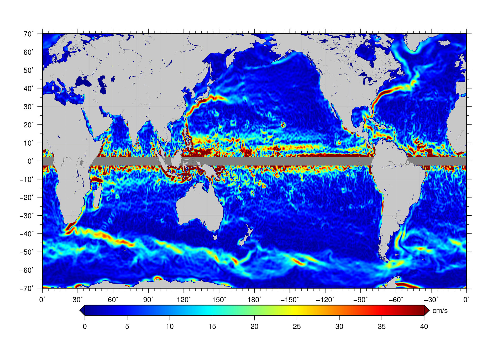
Average speed of ocean surface currents in centimetres per second – shades of blue represent slow currents while red shows the fastest currents. Data from ESA’s GOCE satellite were used to create this map.
Average speed of ocean surface currents in centimetres per second – shades of blue represent slow currents while red shows the fastest currents. Data from ESA’s GOCE satellite were used to create this map.